Introduction:
The COVID-19 pandemic is not only a global public health emergency but also reflects deep social problems and structural inequalities. From the first outbreak in early 2020 to the subsequent surge, COVID-19 has had a dramatic impact on different communities, age groups, and regions.
Our project focuses on the disparities of hospitalization and death rates by COVID-19 across different ethnicity, gender, and age groups in the United States. We argue that these disparities reveal the failure of the public health system to adequately support the vulnerable populations during the pandemic. To explore this, we decided to narrow our focus onto the death rates, which can highlight which groups suffered the most and guide us in proposing ways to reduce future casualties during pandemics or public health crises. In order to do so, we specifically chose to narrow the data and dedicate our time to COVID-19 statistics within the United States. The data we will mainly use is “Trends in United States COVID-19 Deaths, Emergency Department (ED) Visits, and Test Positivity by Geographic Area,” by the CDC. Besides the CDC death tracker, we also pull in COVID‑NET hospitalization rates, state‑level vaccine data, and the 2020 Census so all our denominators line up, which is also by the CDC. This dataset is relevant toward analyzing disparities of hospitalization and death rates by COVID-19 of ethnicity and gender, as it provides detailed breakdowns of COVID-19 outcomes among various demographic groups in the U.S.
From articles such as “Racial and gender-based differences in COVID-19” by Kopel et al and “Disparieties in COVID-19 Outcomes by Race, Ethnicity, and Socioeconomic” by Magesh et al: it seems many scholars and others agree on the fact that there were significant disparities in deaths and hospitalizations, especially among minority groups. Kopel and Magesh have both illustrated that minority groups such as African American, Black, Hispanic, and Asian communities experienced disproportionately higher rates of infection, hospitalization, and death. They also agree that there was a lack of resources during a dire time; many suffered from a lack of resources, which resulted in the casualties of many: there were methods and strategies to ensure more would survive. Upon the mutual understanding each one had, there were disparities in disputes of gender. It seems while it is true there were more casualties upon males, in some other states females seemed to have more casualties: there are still unknowns and questions as to how diseases such as COVID-19 can affect males and females based on biological factors. Some crucial information that has not been explored yet is how diseases such as COVID-19 could affect those undergoing biological transformation or hormone changes.
We will study the impact of COVID-19 on different communities to better understand the disparities that exist across ethnicities and genders. Our findings can inform early‑warning dashboards that trigger surge staffing or mobile ICU deployments whenever a state’s hospital‑fatality ratio breaches a predefined threshold, so we can help people understand how to better protect themselves from current and future diseases and recognize the systemic changes needed to improve public health. Ultimately, we want to show that these health gaps are built into the system, not just individual choices.
-
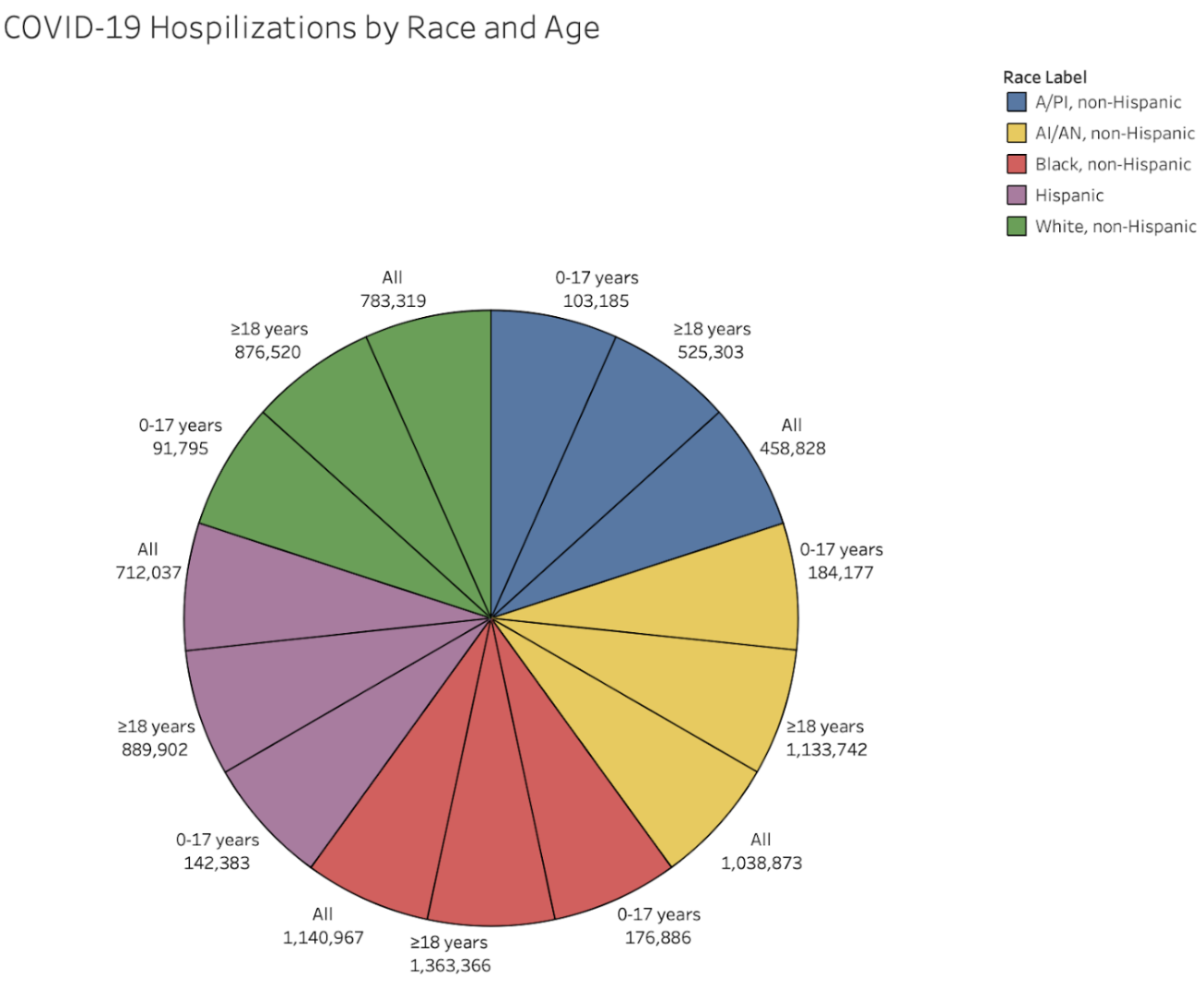
This pie chart visualizes the distribution of COVID-19 hospitalizations in the United States by race and age group. It categorizes data by five racial groups — Asian/Pacific Islander (A/PI), American Indian/Alaska Native (AI/AN), Black, Hispanic, and White (all non-Hispanic) — and divides each by age: 0–17 years, ≥18 years, and all ages combined.
The pie chart reveals clear disparities in hospitalization by race and age. Black, non-Hispanic individuals aged ≥18 years have the highest cumulative rate at 1,363,366 hospitalizations, followed closely by AI/AN (American Indian/Alaska Native), non-Hispanic adults, and other racial groups aged ≥18. In contrast, all groups aged 0–17 years show much lower hospitalization rates, highlighting how adults, especially those from marginalized racial groups, were disproportionately affected. This reflects broader systemic inequalities in healthcare access, underlying health conditions, and occupational exposure risks.
These disparities align with findings by Wortham et al. (2021), who observed that socioeconomic factors such as, poverty, limited healthcare access, and crowded living conditions, contributed to significantly higher hospitalization rates among racial minorities. The data emphasizes the need for targeted public health strategies that address structural barriers and provide equitable support to vulnerable communities during public health crises.
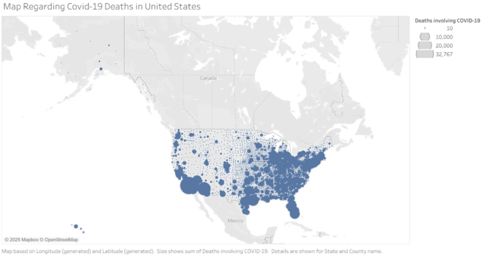
A map of COVID-19 deaths that occurred within the United States.
The map indicates the locations where the most deaths from COVID-19 occur. Upon examination, we can see major groupings and large dots of death within major cities and states, such as New York, New Jersey, Michigan, Florida, and Southern California. This raises concerns about how we should reconsider the construction of future buildings and identify areas that need the most aid in upcoming pandemics/outbreaks of viruses; be cautious of the cities.
Regarding going back to one of our research questions, it is which state had the highest death rate; states like New York, California, Florida, and Michigan suffered the most, as areas that are crowded and dense in population are more prone to infection than urban areas. cautious when going into heavily dense populated and close urban areas, which is stated in an article, “A Survey of Public Health Failures during COVID-19,” by Dominquez et al. (2022) The article also stated how there were areas that did not get enough resources, so the disparities between different geological areas indicate the need for the public health system to understand where to divert their attentions to and for the public to start realizing the preventative methods we need to take to prevent the spread of an outbreak.
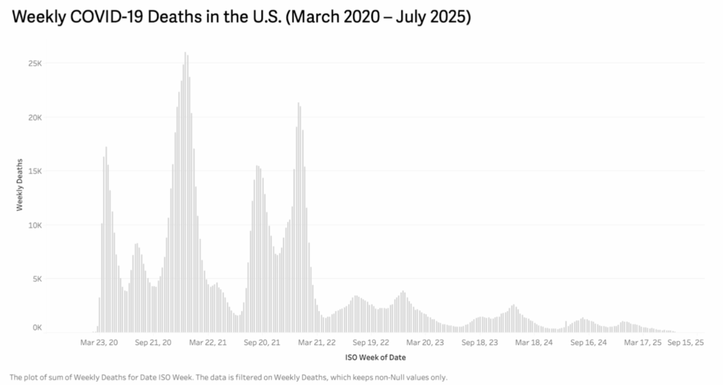
A histogram of the weekly COVID-19 deaths in the United States from March 2020 to July 2025.
This histogram visualizes the total number of weekly COVID-19-related deaths in the United States over a five-year period, from March 2020 to July 2025. The x-axis represents the date by ISO week, while the y-axis shows the number of reported deaths during that week.
The chart clearly illustrates the timeline and intensity of COVID-19 death waves. The most severe peaks occurred during the winter of 2020–2021 and again in early 2022, with weekly death counts exceeding 25,000 at their highest. After that, there is a noticeable downward trend, though periodic smaller waves continued into 2023 and early 2024. By 2025, weekly death numbers dropped significantly, indicating improved control over the pandemic, possibly due to increased vaccination, better treatments, and adaptive health policies.
This visualization directly relates to our research questions about the evolution and impact of COVID-19 in the U.S. over time. It highlights the importance of timely public health interventions and reveals how seasonal surges placed repeated strain on healthcare systems. According to the findings by Onigninde et al. (2021), there are methods and encouragement for techniques to deal with current and future outbreaks: one of the methods involves the usage of cadavers to inspect the bodies of the dead and perform chemical tests to figure out a solution/way to retain COVID-19 or future outbreaks. As we can see again from the map, it seems that methods such as cadavers and others are making an impact on reducing the number of deaths corresponding with COVID-19.
This is a bar graph of the total rates of hospitalization by sex and race.
This bar graph illustrates the disparities between the different races and genders. The graph categorizes hospitalization into groups of A/PI, AI/AN, Black, White, Male, and Female. The bar chart indicates disparities in hospitalization by race; nearly 2600k Blacks are hospitalized, followed by the next highest being AI/AN with nearly 2400k, which is a big difference compared to the White and Hispanic populations sitting at around 1800k: there is nearly an 800k difference. This reflects broader systemic inequalities in healthcare access and underlying health conditions. With the gender difference also being only about 100k, with the male having more casualties.
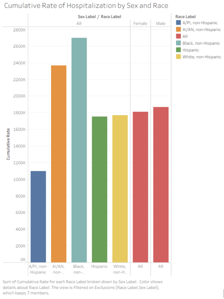
These disparities align with findings by Kopel et al. (2020), who also discovered significantly higher rates of infection of COVID-19 amongst African Americans, who constitute 33% of hospitalized patients: this information dictates that there needs to be distinct emphasis on the need for targeted public health strategies that would protect communities that specifically need it more than others. Along with the statistical data, Kopel et al, also discovered that both men and women suffered from infection rates similarly, with men being at a slightly higher risk than women; overall, they conclude there needs to be more research into gender disparities, which can also be shown on the graph, as the gender difference is not tremendously large. We need to come up with methods to assist those who are more prone to infection.
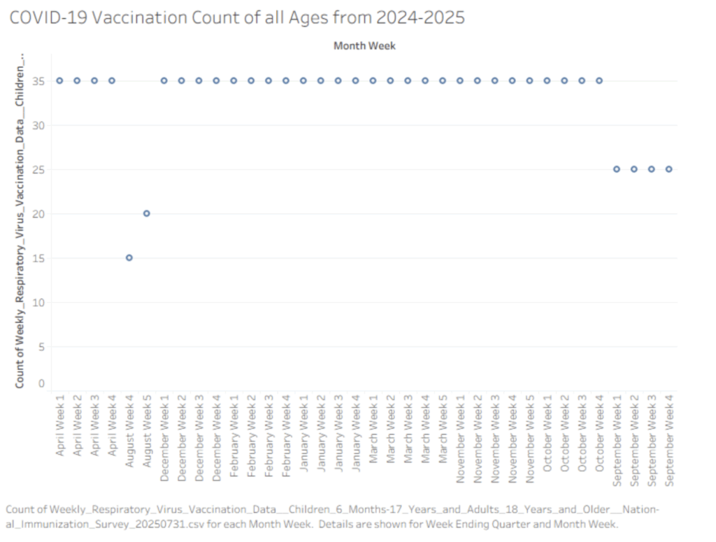
A Scatterplot of Covid-19 Vaccination Count from April to September 2024-2025.
The scatter plot illustrates the weekly doses of vaccination shots administered to individuals of all ages throughout the year. Transitioning from April to August, we maintain our highest dose of vaccination, while transitioning to August, we seem to have experienced a major decline from 35 to 15. After August, our doses of weekly vaccination remain high in the 35 from December to October. However, from September on, it seems that there is a steady vaccination rate at 25 instead of 35. This difference is significant, as we should aim to understand why the people started taking fewer vaccinations.
To further explain the vaccination dosage, De Guadamuz et al. (2022) expressed that statistically speaking, approximately 80% of adults take the COVID-19 dosage, and only 45.7% received a booster, with specific disparities amongst Black (35.7%) and Latinx (35.5%) people and those with poverty status (31.1%) and food insecurity (27.1%). With the given data in mind, we can start to understand that the different living conditions will gradually bring the need for people to want to take the vaccine dosage, as it may be too tense and stressful. This is a call for the public health system to make the resources like vaccines more accessible for everyone equally
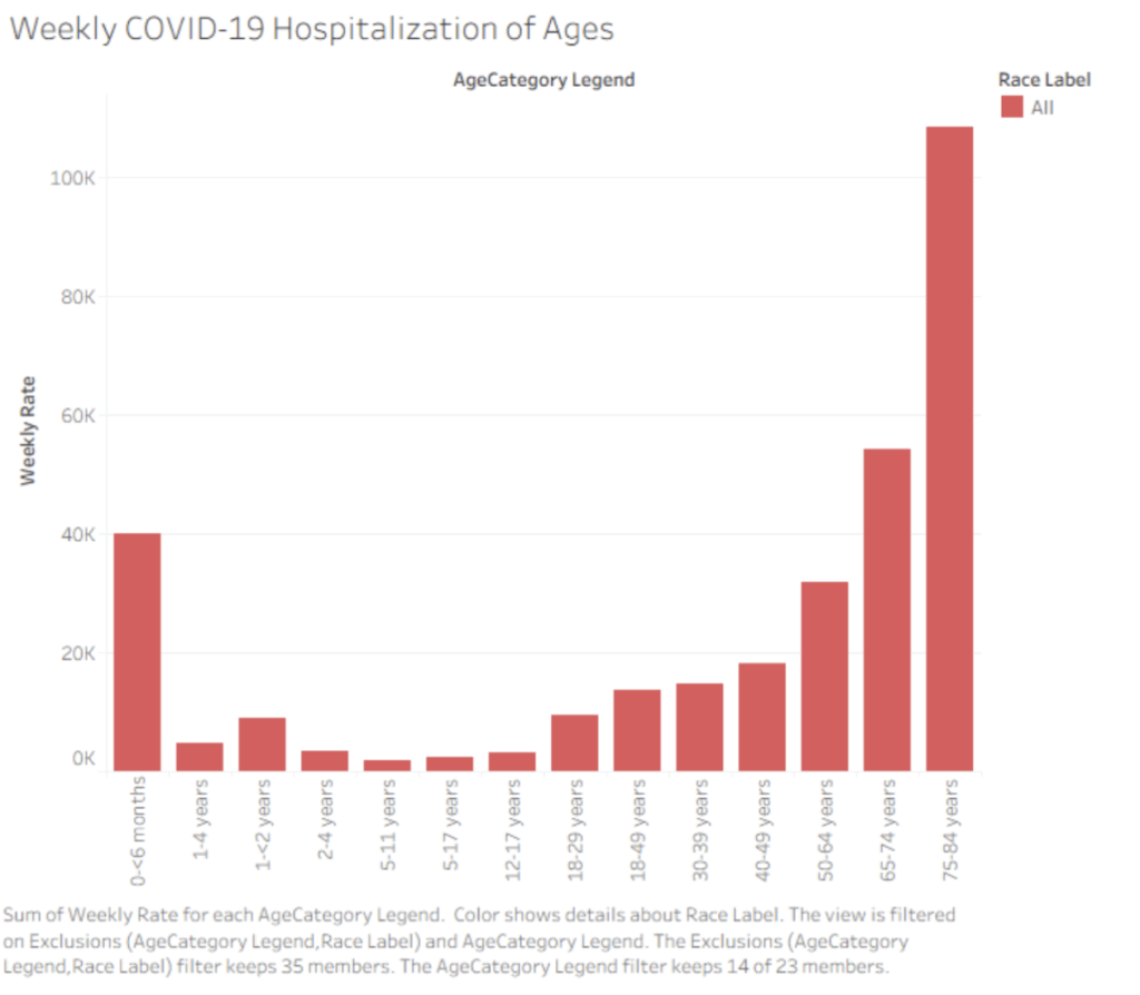
A bar graph of the weekly hospitalization by age.
The bar graph includes categories of all ages, with them being less than 6 months, 1-4 years, 1-2 years, 5 -11 years, 5- 17 years, 12-17 years, 18-29 years, 18-49 years, 30-39 years, 40-49 years, 50-64 years, 75-84 years. Initially we start at with a peak of 40k weekly hospitaliaztion rate for less than 6 months, then we drop to less than 20k wekely hospitalization rate for people ages of 1 – 40. However, despite the count being so low, we see a gradual increase from 1-4 years to 40-49 years. From 50-64 years we experience a drastic increase such that we spke to around 30k, then for 65-74 years we spike to above 50k hospitalization, and reaaching a peak of above 100k for people 75-84 years old.
As illustrated bu Gupta et al. (2021): the reason why this graph would slope upward is because they explored that the risk of COVID-19 death increased with age, and the highest risk of death was observed in those older than 89 years of age. These disparities leads up to the fact that we must inform the public health section that we need to direct resources and more concerns to those who are more elderly than others as they are more prone to infection risks. Alongside the elders, we should also take extra precauctions when delaing with infants younger than 6 months as they too are high-risk to infection.
Overall, going forth we should inform and revise ideas and plans on providing assistance to the elders and infants during these outbreaks.